
Understanding Website Headers: Usage, Benefits, and Best Practices
A website header plays a crucial role in creating a positive user experience and conveying important information to visitors. The header also streamlines navigation and enables visitors to use the website the way they need. It is the top section of a website that typically appears consistently across all pages. In this blog post, we will explore what a website header is, discuss its usage, and highlight the main benefits and tips for its best use.
Before drilling down too deeply into the main elements of a website header, let’s define the key terms you should be familiar with.
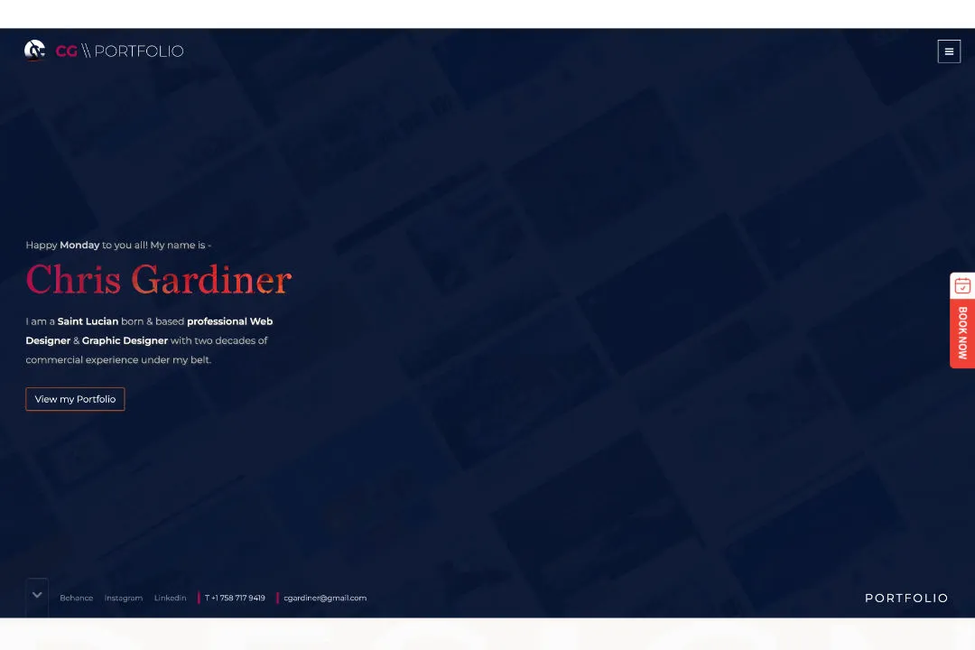
- The header is the web page’s top section that normally contains the elements that simplify the visitors’ interactions with the website.
- The hero is usually an image or a banner at the top of the website. Often used to introduce the website’s concept to the visitors and grab their attention.
What is a Website Header?
A website header is a prominent section positioned at the top of a web page. It usually spans horizontally across the entire width of the page and remains fixed or scrolls with the content. The header often contains elements such as a logo, navigation menu, contact information, search bar, social media icons, and sometimes a call-to-action.
The header is one of the most influential areas of a website. Its core function is similar to the one performed by an information sign that guides visitors through the website. It should serve as the key means of navigation.
Listed below are the general usage and purpose of a Header element:
- Branding: The header provides an ideal location for displaying your logo, reinforcing your brand identity, and enhancing brand recognition.
- Navigation: The primary navigation menu within the header allows visitors to easily access different sections of your website, improving user experience and site usability.
- User Account: A means of logging into the backend or dashboard of Content Managed (CMS) enabled websites.
- Contact Information: Including contact details, such as a phone number or email address, in the header enables visitors to quickly find and reach out to you.
- Search Functionality: Not always used but a handy addition when needed - the search bar in the header allows users to search for specific content on your website, saving them time and enhancing usability.
- Social Media Integration: By incorporating social media icons in the header, you can encourage visitors to connect with you on various platforms and expand your online presence.
The Pros of Effective Header Usage:
1. Enhanced User Experience: A well-designed header helps users navigate your website easily, find desired information quickly, and have an overall positive experience.
2. Brand Consistency: The header provides a consistent visual element throughout your website, reinforcing your brand identity and creating a cohesive look and feel.
3. Improved Site Navigation: Your website’s visitors want quick access to information, with a clear and intuitive navigation menu in the header, visitors can effortlessly explore different sections and find relevant content.
Did you know that in fact, 55% of website visitors spend less than 15 seconds on your website pages before deciding to leave. Some of the key reasons for this are the overly complex website’s, unclear messaging and poor usability.
4. Increased Conversions: Strategically placing a call-to-action button or links in the header can lead to higher conversion rates by prompting visitors to take desired actions.
Best Practices for Header Design and Usage:
1. Choose a suitable font: Keep the header clean and uncluttered to avoid overwhelming visitors. Opt for a minimalistic design that focuses on essential elements and aligns with your overall website aesthetics.
2. Responsive Design: Ensure your header is responsive, adapting well to different screen sizes and devices. It should remain functional and visually appealing across desktops, tablets, and mobile devices. Note that most users today view website on mobile devices, so focus on your Mobile UX.
3. Clear Navigation: Use concise and descriptive labels for menu items. Limit the number of main navigation (4 - 5) options to avoid overwhelming visitors and make sure submenus are easily accessible.
4. Strategic Placement: Position crucial elements such as the logo and navigation menu in the header's prime real estate, making them highly visible and accessible.
A standard nav menu is something like this :-
Logo (left) - Navigation links (4-5 links) - Call to action (right)
Use a dropdown for additional links if needed.
5. Visual Hierarchy: Apply visual cues like colour, size, and typography to guide users' attention within the header. Use contrast to highlight important elements, such as the logo or call-to-action. Use simple UX techniques to show the page that you are on, hover states for links to indicate what can be clicked.
6. Consistency: Maintain a consistent header design throughout your website. This consistency ensures familiarity, reduces confusion, and reinforces your brand image.
7. Your above the fold design: Ensure to answer the following three question.
ONE - who are you?
TWO - What do you do?
THREE - How can we help you?
Remember to design your page in a way that the user knows if there is additional data below the fold, the commercial term for this is 'false bottom'.
4 Tips for an effective header design
1. Choose a suitable but attractive font: There are hundreds of available fonts out there, additionally you can always fall back on Google Fonts if you need to. Choose something falls within the branding or something that simple WOWs the user.
Note. Anything added to your site (like Google Fonts) that needs to communicate with a source outside of your site and server will have the potential to slow your website down - especially in Mobile.
2. Attractive visuals: Whether its an image or a graphic, select something that works with the site you are designing, falls into the branding wheelhouse and something that SELLS the initial message for the site - creativity is key here.
Note. The use of background videos, hi res images and JS etc. are cool and all but be wary of how they affect your sites speed. All you have is roughly 3 seconds on desktop and 2 on mobile to capture the attention of a user.
3. Clear Call-to-action: Don’t over do it here, a clear call-to-action should be decisive, clear and obvious to the user. But not so much that it is annoying!
4. Get creative: There is no magic formula here, not everything fit in to every situation. A lot depends on the business goals of the site, type of site that is being built and who the audience is. Understanding your audience is paramount to fulfilling the goal and designing something that stands out to you audience.
Conclusion:
A website header serves as the gateway to your website, providing visitors with essential information and navigation options. By implementing a well-designed and thoughtfully structured header, you can enhance user experience, reinforce your brand identity, and improve overall site functionality. Remember to follow best practices, keep it simple, and prioritise usability to make the most of your website header.
If you are interested in seeing suitable examples, let me know and I will write a post on that subject.